
Why Packaging Visuals Are the First Brand Impression — and How to Nail Them

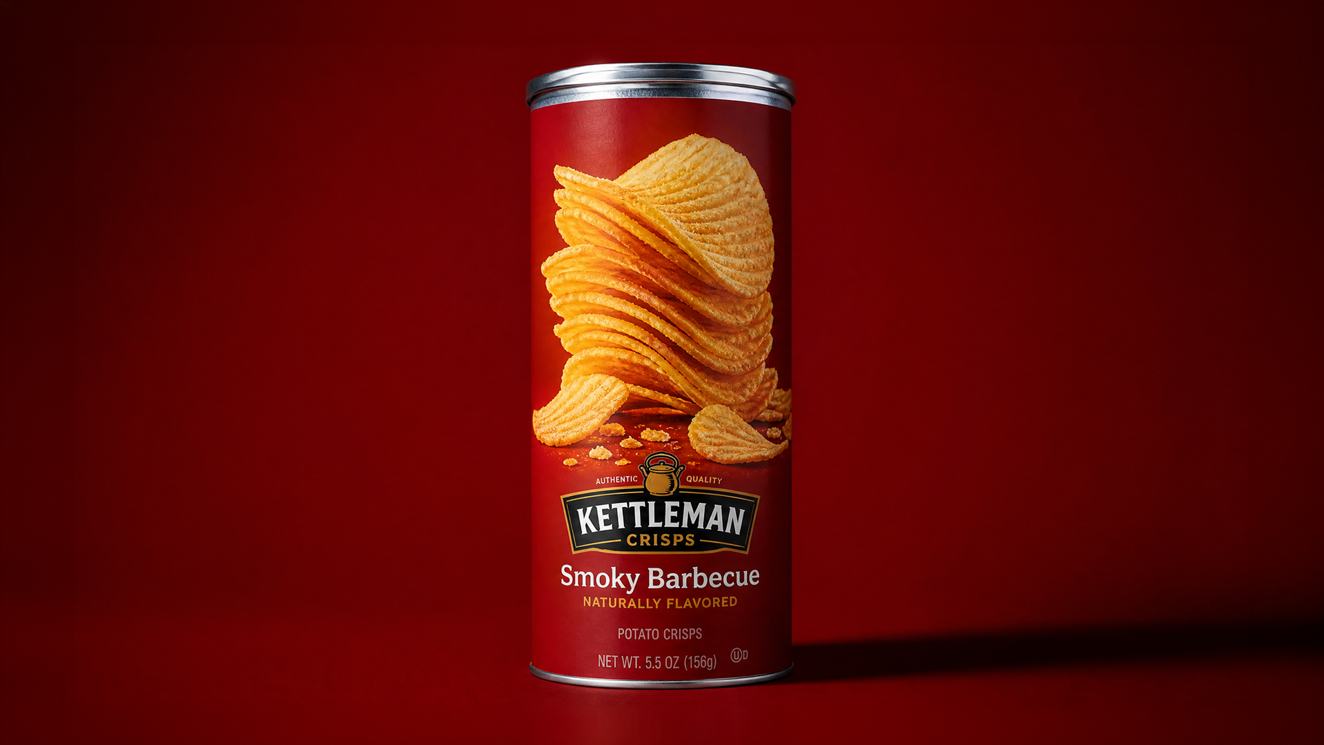
Before anyone tastes your product, smells it, or reads a single ingredient, they’ve already formed an opinion of it. That opinion gets made in about two seconds, scrolling past a feed or scanning a shelf, and it’s made almost entirely off one thing: how the packaging looks in the image they just saw.
We say this to brand managers constantly, and it still surprises how many teams pour their budget into the product formula and the packaging design itself, then treat the visual that actually represents it online as an afterthought — a quick phone photo, or a rushed shoot squeezed in before a launch deadline.
That’s backwards. The physical pack is what the customer holds after they’ve decided to buy. The image is what makes them decide to buy in the first place.
What “first impression” actually means in FMCG
On a shelf, packaging works in the hand — texture, weight, how the label catches light as someone turns it. Online, none of that exists. All a customer has is a flat image, usually seen for a second or two, often on a small screen, often next to three competitors doing the exact same category.
In that context, a packaging visual has to do work the physical product never has to do alone. It has to signal quality, freshness, and category correctly, instantly, without any of the tactile cues that usually help. A slightly flat render, an off-color label, a plastic sheen that reads cheap instead of premium — customers don’t consciously notice these things. They just scroll past a little faster.
The three things that quietly wreck packaging visuals
Color inaccuracy. This is the one that costs brands the most without them realizing it. A label that’s supposed to be brand-red rendering slightly orange, or a green that’s too saturated, breaks brand recognition on a subconscious level even when the customer can’t name what’s wrong. If someone knows your brand’s color from years of exposure, an inaccurate render feels subtly “off” even to someone who’s never seen your Pantone reference.
Flat, single-source lighting. A lot of rushed packaging shots use one soft light and nothing else. It’s fast, it’s cheap, and it makes almost every product look like a stock photo. The packs that stop the scroll use directional light, some contrast, a highlight that shows off the material — matte, glossy, foil, whatever the actual finish is.
Ignoring the material itself. Plastic isn’t cardboard isn’t foil isn’t glass. Each reflects and absorbs light completely differently, and generic rendering setups often flatten all of them into the same look. If your pouch is matte and your visual makes it look glossy, you’ve misrepresented your own product — and customers who buy based on that mismatch tend to feel it wasn’t what they expected, even if they can’t articulate why.
What actually nails it
The packaging visuals that work share a few things in common, regardless of category:
They render the material honestly — matte stays matte, foil actually catches light like foil. They use directional lighting that gives the pack dimension instead of flattening it. And they’re color-accurate to the brand’s actual palette, checked against real references, not eyeballed.
This is exactly where CGI earns its keep over traditional photography for packaging specifically. A physical shoot means the actual product needs to exist, needs to travel to a studio, needs to survive handling without a scuff or a dent showing up under studio lights — and if the packaging design changes even slightly before launch, you’re reshooting. A CGI-built pack can be lit from any angle, updated the moment a label changes, and rendered at a resolution that holds up on a billboard or a phone screen equally well.
The part most teams skip
None of this matters if the visual doesn’t match what’s inside the pack. We’ve seen brands over-polish a render to the point where the actual product, once it arrives, feels like a letdown next to the image that sold it. That gap is what drives returns and bad reviews, not the render being “too good.”
The goal isn’t to make packaging look better than it is. It’s to make it look exactly as good as it actually is — which, for most FMCG products, is a lot better than the average phone-shot listing image currently shows.
If your packaging visual is the first thing a customer sees, it’s worth treating like the first impression it actually is.
Squirrel Studio produces CGI packaging visuals and product renders for FMCG brands across Egypt and the GCC. If your packaging deserves a better first impression, let’s talk.
